
Online travel agency
B2C
Booking process
Style definition
Research plan
Senior UX/UI Designer (Product) for Volario, one of Airsiders travel platforms.
Focus: Visual and interaction design, Prototype, Journey mapping, Stakeholder management, User research
Volario is an online travel agency specialising in virtual interlining, connecting flights from different carriers to offer seamless, cost-effective travel itineraries.
design objectives
1.
Clearly communicate the reliability of different-airline connections to build user confidence and reduce drop-offs.
2.
Establish design alignment and consistency across products and versions.
3.
With the product being initially shaped by industry standards, we needed to validate the team’s many assumptions about user needs through research.
4.
Create visibility across the full service and user journey to ensure alignment in a fast-paced, ever-evolving environment.
redefining the style
One of my first projects was the redefinition of the personality and style of the project, it was an opportunity to establish a stronger identity, align the team, and create clear design direction.
This style redefinition wasn’t about solving a clear problem—it was about creating a cohesive vision.

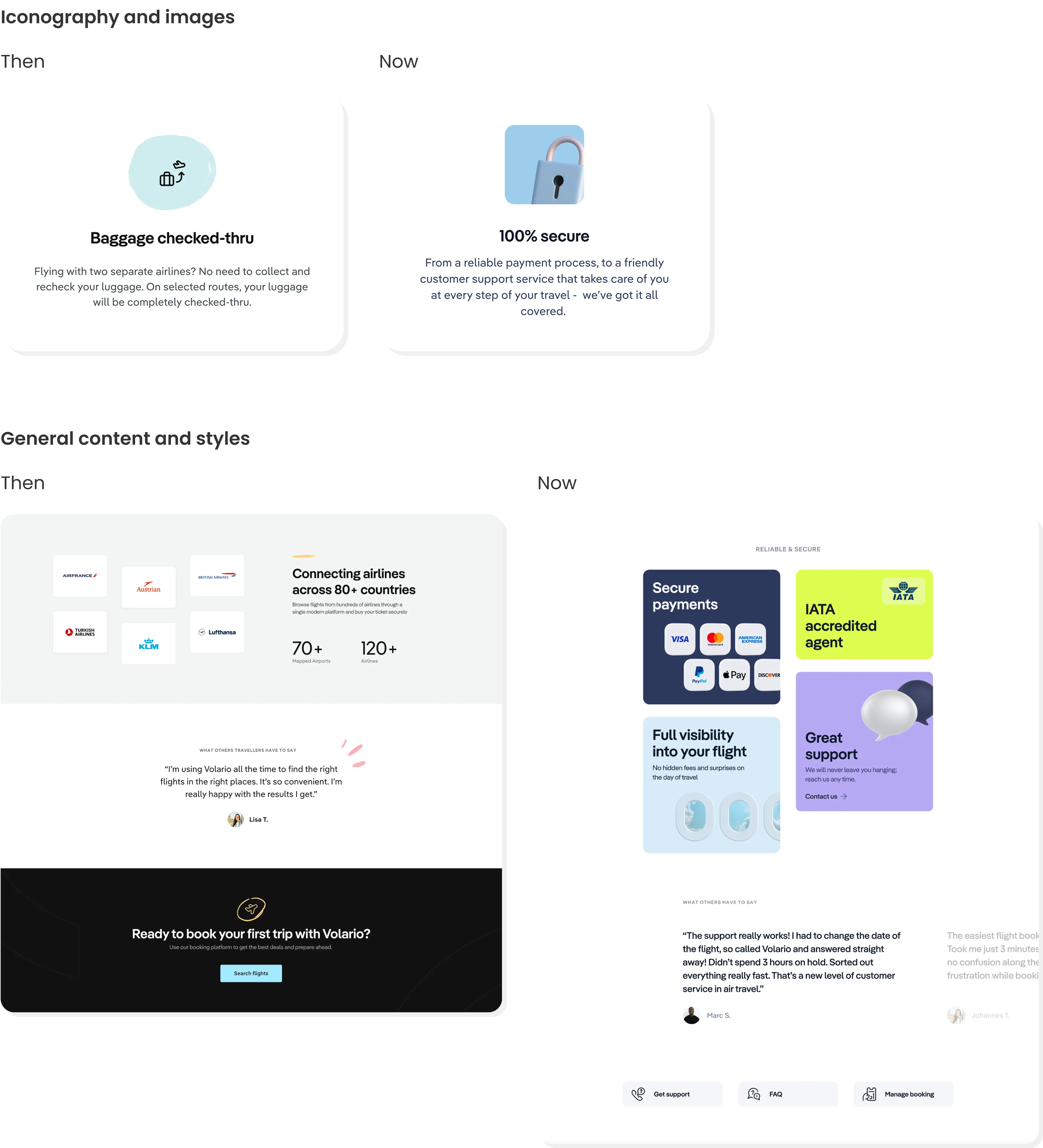
Impact
I was able to gain ownership of the design direction and ensure consistency across all touch points.
We aligned the style and content with the evolving needs of the project.
evolving the booking flow
The existing booking flow worked but needed to adapt as we added new services, options, and providers. My goal was to improve usability while aligning with the newly defined brand and addressing stakeholder priorities.
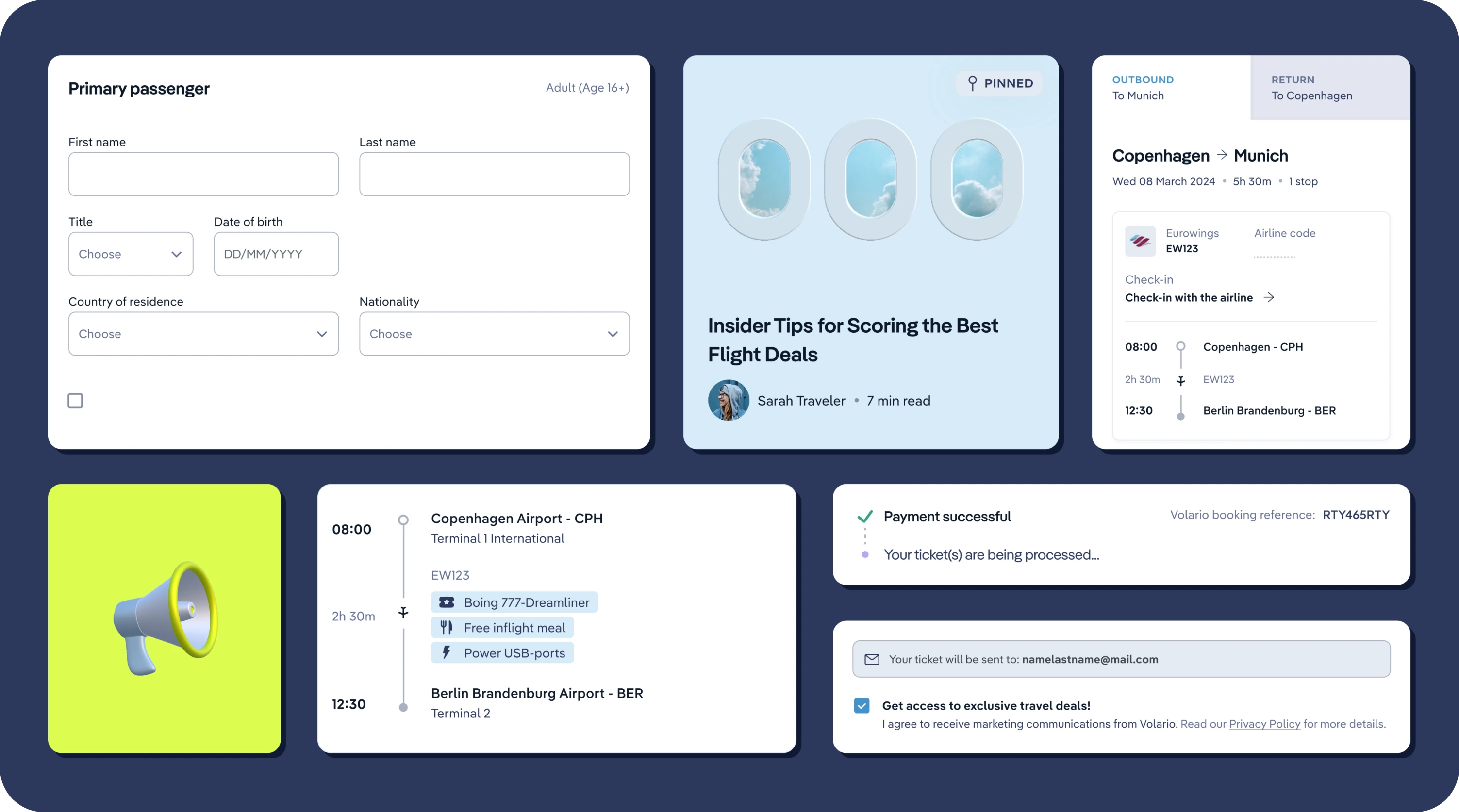
Passenger details & first impressions
For most users coming from providers, this was their first look at Volario. We focused on making the journey details easy to understand and streamlining personal information entry with clear feedback and instructions.

Ancillaries
Extra bags and flexible tickets—key profit drivers for OTAs—varied widely by provider, airline, and fare. We refined how these were presented to simplify selection.

Payment options
The final step needed to be seamless: a smooth payment experience, a clear summary of passengers and journey details, multiple payment methods, and for Marketing needs, an optional newsletter sign-up.

Confirmation
Many users weren’t familiar with OTAs and expected direct airline service. We prioritised clear booking status, detailed journey breakdowns with all airlines and check-in codes, and layover conditions to set expectations upfront.

visualising the full experience
With the booking flow in place—largely shaped by industry standards and stakeholder expectations—I wanted to uncover broader user experience issues and align the team around a shared understanding of the customer journey.
Plus, we had insights from Hotjar, Analytics, and plenty of assumptions that needed to be documented and validated.
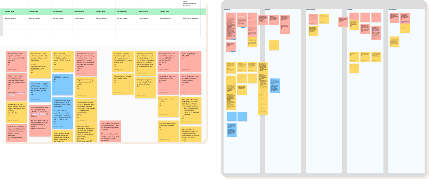
Service mapping
I mapped out every touchpoint, from automated emails to customer support interactions.
I organised sessions with key contributors across Product, Customer Success, and other teams to refine the map with their insights and firsthand experiences.

During these sessions, we captured notes on known passenger’s issues or general assumptions.
We then grouped all internal feedback into themes, which shaped new tasks aimed at improving customer satisfaction and retention—some of which were incorporated into the following year’s roadmap.
talking to customers
While we had plenty of internal ideas, I wanted to ensure we were prioritising the right improvements by speaking directly to users. For this, I developed a lightweight, low-budget research process that fit into our team’s busy schedule.
We wanted to:
Understand returning customers – Why they chose us again and what value they see in our OTA.
Identify pain points – Where users struggle in the booking flow and overall experience.
Recognize what works – What aspects users appreciate and how we can build on them.
With a decent stream of bookings each month—including a small but growing number of repeat customers—it was the perfect time to introduce a structured approach to user feedback.

I documented a Research Plan to outline the goals, structure, and conditions for these studies:
1. Monthly customer selection – Choosing a small group of users to speak with.
2. Direct email Invitations – Reach out with a clear and compelling invitation.
3. Interview Script – Regularly refined to match our focus.
4. Scheduling and video-call – Seamless coordination with Hotjar Interviews.
5. Capturing Findings – Document and discuss insights, updating the service map accordingly.
6. Sending incentives – Providing fair compensation (€50 gift card).
measuring success and challenges
Tracking impact was complex – The fast-paced nature of the project meant multiple changes—new providers, airlines, pricing models, and design updates—were happening at once, making it difficult to isolate the effect of any single improvement.
Reducing friction for users and support teams – While traditional performance tracking wasn’t always feasible, we wanted to focus on specific, tangible indicators, like aiming to reduce support calls related to check-in confusion and booking errors.