
about Issuu
Issuu is a digital publishing platform loved by creators worldwide for its iconic flip book experience, which transforms PDFs into interactive, magazine-like digital content.
With millions of users, Issuu empowers publishers to share their stories while maintaining the essence of traditional print design.
challenge
Issuu’s team had conducted extensive user research, gathering insights from interviews and feedback collected by the Customer Success team. Over time, a pattern became clear: accessibility issues were holding some users back.
While the “real book” aesthetic delighted content creators and loyal readers, it created barriers for many others. Readers, particularly on mobile devices, struggled with readability, font scaling, and adaptability. These challenges highlighted the need for a more inclusive and user-friendly experience.
Key insights:
Accessibility improvements were essential for modernising the flip book without losing its traditional appeal.
Mobile readability was a major challenge for users, often struggling to navigate and read comfortably.
quick prototyping
The product team prioritised accessibility as a top focus area. In collaboration with my design manager, we proposed a rapid prototyping approach to quickly bring feature ideas to life.
The prototypes were instrumental not only in visualizing solutions but also in fostering early alignment within the team, ensuring everyone shared a clear vision of the path forward.
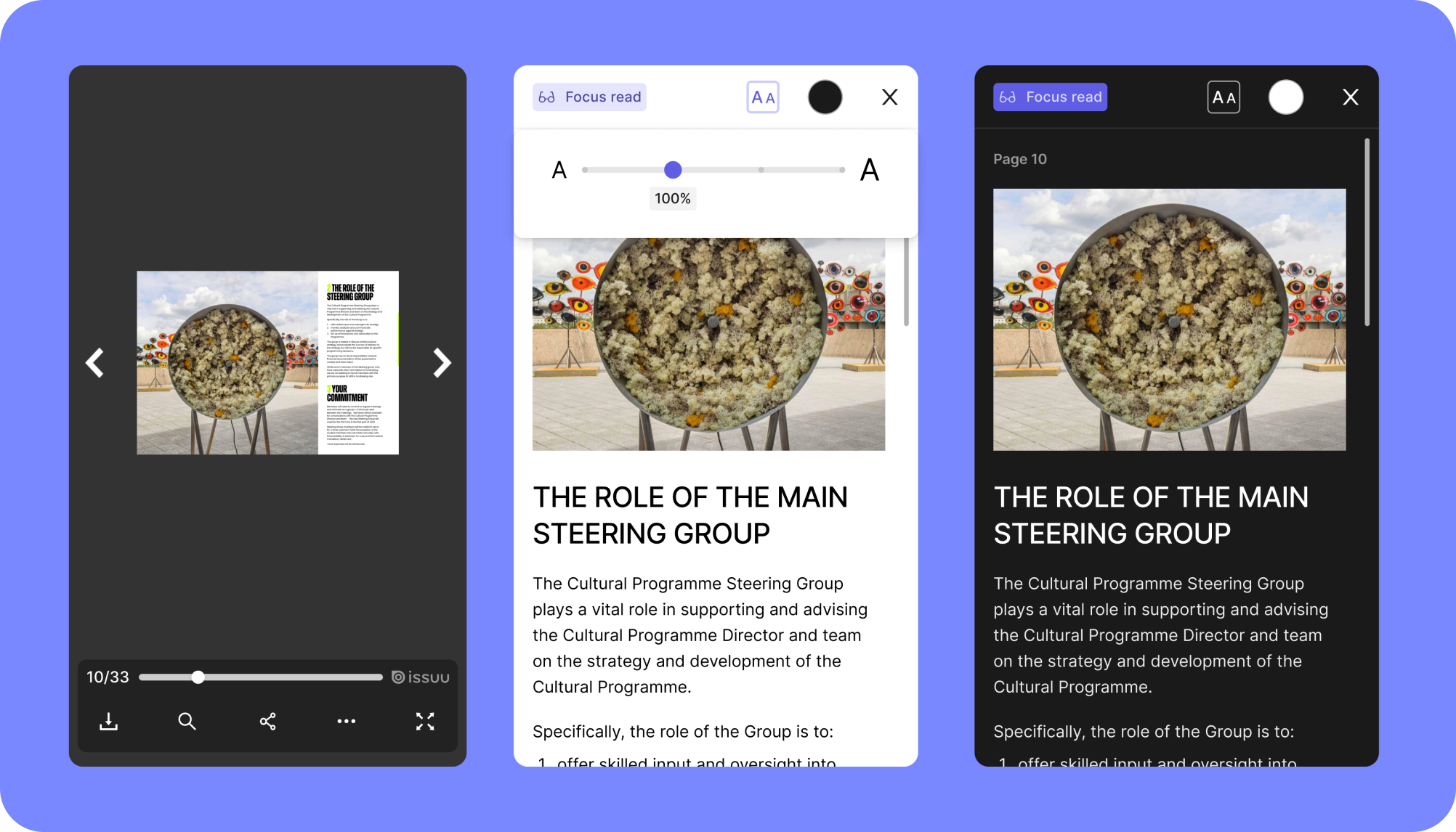
Seamless transition between formats
Introduced initially as a new “Focus read”, it allows users to switch from the traditional flip book view to a more accessible reading format. The main goal is to make transition seamless, enabling readers to move back and forth between formats while continuing their reading experience fluidly.
Adjustable font size
To improve readability for all users—especially those with visual impairments—we introduced the ability to customise text sizes, empowering readers to adjust text to comfort level and making the content more accessible.
Light/dark mode
This feature allows readers to switch seamlessly between modes, ensuring a more comfortable and personalised reading experience that caters to different lighting conditions and user preferences.
outcome
The prototypes successfully communicated the vision for an updated flip book experience, paving the way for a roadmap focused on accessibility.
As on-the-side Book designer, I’ve always appreciated the nostalgic charm of the flip book format, mimicking reality with pages, shadows, and turn-of-page animations. By combining this connection with user insights and iterative prototyping, I helped imagine a flip book experience—more inclusive, adaptable, and ready for the future.